Font color of the text on primary buttons. For example, the primary buttons on Liveboard, Answer, Data workspace, SpotIQ, or Home page.
CSS variables reference
Table of Contents
- Application-wide settings
- Navigation panel
- Menu elements
- Dialogs
- Button elements
- Checkboxes
- Lists
- Liveboard
- Visualization and Answer
- Axis title and labels on charts
- Spotter interface
- Natural Language Search interface
- Search bar and Data panel
- Homepage modules (New experience mode)
- Sample CSS file with variable definitions
- Additional resources
The ThoughtSpot CSS customization framework defines a number of variables for applying styles throughout embedded ThoughSpot components.
Application-wide settings🔗
The following example shows the supported variables:
| Variable | Description |
|---|---|
| Background color of the Liveboard, visualization, Search, and Answer pages. |
| Color of the text on application pages. |
| Color of the text on application pages. |
| Font type for the text on application pages. |
| Text transformation specification for UI elements in the app. |
| Font color of the text on toggle buttons such as All, Answers, and Liveboards on the homepage, chart and table titles on the Answer page, and object titles on list pages such as Liveboards and Answers. |
| Background color of the toggle buttons to switch between All, Answers, and Liveboards on the homepage. |
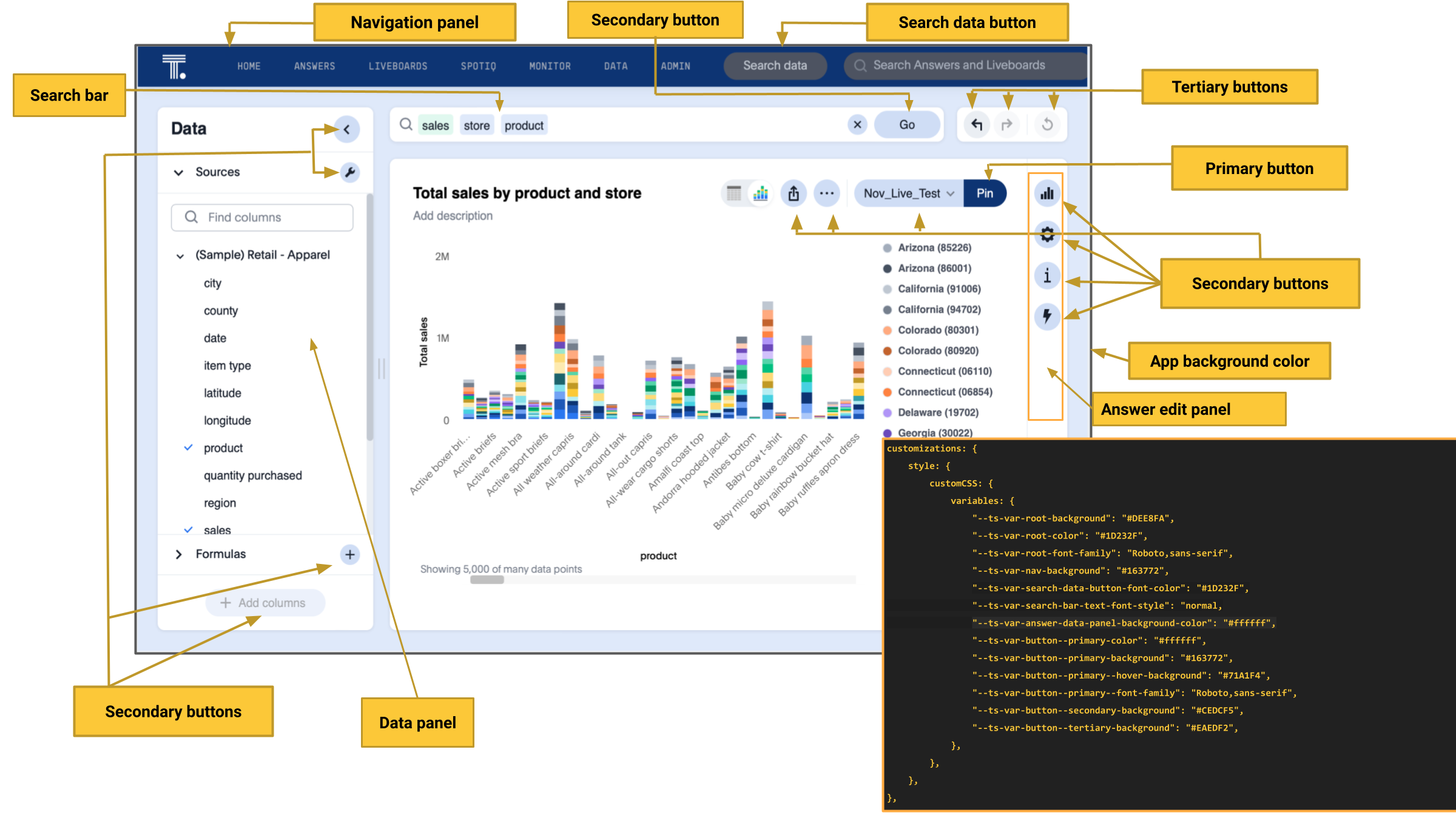
Navigation panel🔗
The navigation panel appears at the top of the application page.
| Variable | Description |
|---|---|
| Background color of the top navigation panel. |
| Font color of the top navigation panel. |
| Background color of the Search data button. |
| Color of the text on the Search data button. |
| Font of the text on the Search data button. |
Menu elements🔗
CSS Variables for More menu  , contextual menu, and dropdown selection panels.
The More menu appears on Liveboard, visualization, answers, SpotIQ, and several other application pages. Contextual menu appears when you right-click on a data point on a chart or table.
, contextual menu, and dropdown selection panels.
The More menu appears on Liveboard, visualization, answers, SpotIQ, and several other application pages. Contextual menu appears when you right-click on a data point on a chart or table.
| Variable | Description |
|---|---|
| Font color of the menu items. |
| Background color of menu panels. |
| Font family specification for the menu items. |
| Text capitalization specification for the menu items. |
| Background color for menu items on hover. |
| Background color of the menu separator. |
| Font color of the menu item in selected state. |
Dialogs🔗
CSS variables for dialogs that prompt the user to select an option or enter information. For example, the Liveboard pin dialog that appears on clicking Pin on the Search results or Answer page, the Show underlying data dialog that appears on clicking Show underlying data on a Liveboard visualization or Answer.
| Variable | Description |
|---|---|
| Background color of the dialogs. |
| Font color of the body text displayed on dialogs. |
| Background color of the header text on dialogs. |
| Font color of the header text on dialogs. |
| Background color of the footer area on dialogs. |
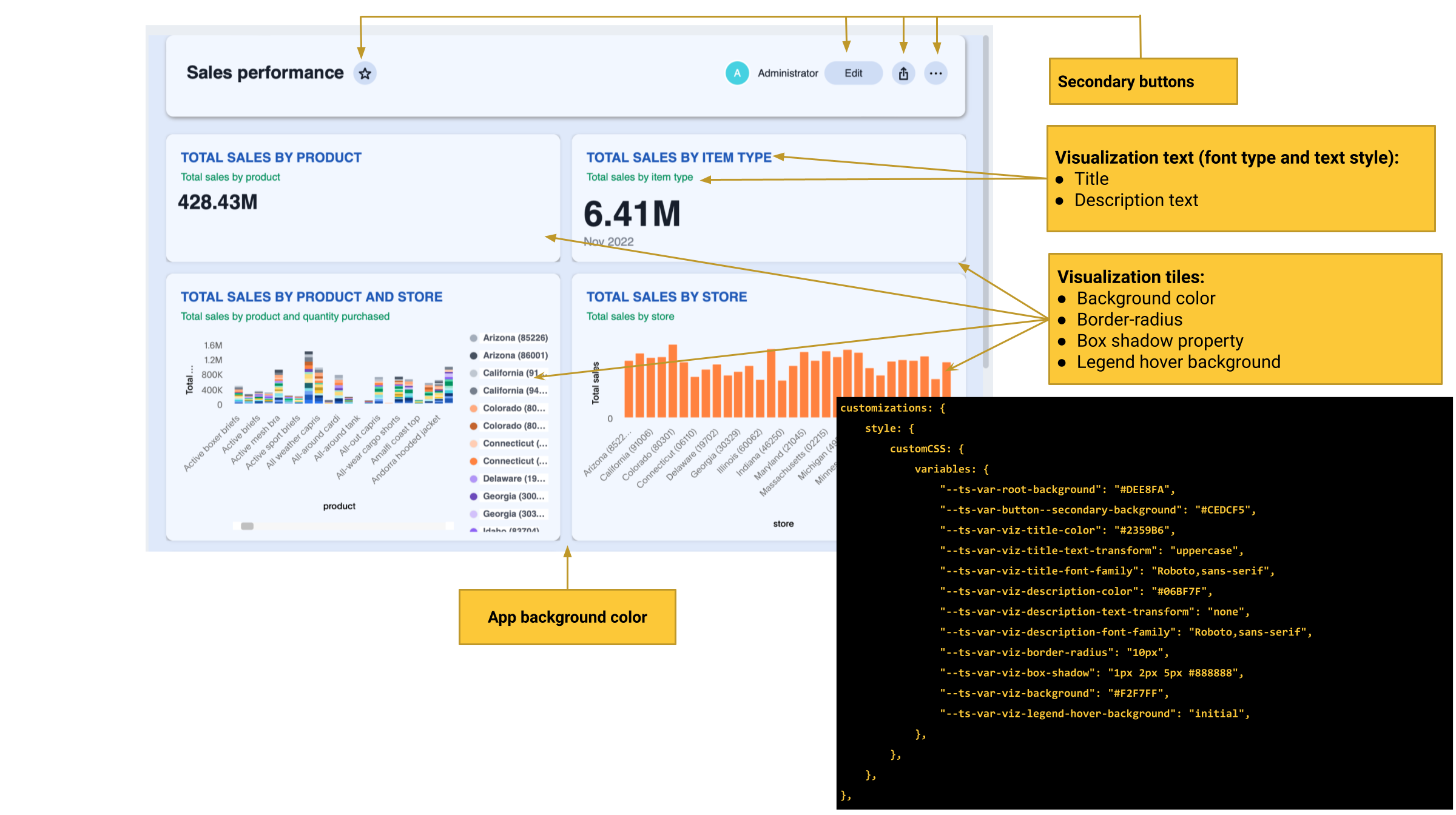
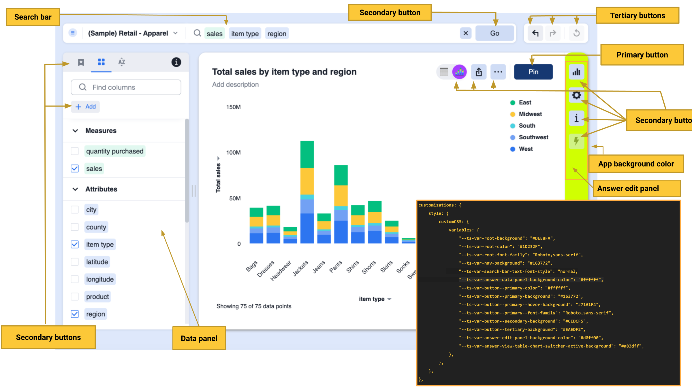
Button elements🔗
ThoughtSpot application contains the following types of button elements:
-
Primary
Buttons that trigger an action for an entire page or a container. For example, the Go button on the search bar.NoteThe Go button appears as a primary button when the search bar is in the focused state. If you click outside the search bar or execute the search query to load search results, the Go button changes to a secondary button.
Primary buttons may contain text, text with an icon, or just an icon.
-
Secondary
Buttons that trigger additional actions. For example, More menu and Share buttons on a Liveboard. -
Tertiary
Buttons that are less prominent and trigger independent actions for sub-tasks on a page. For example,the Undo, Redo, Reset buttons on the Search page.
Use the following variables to customize buttons.
| Variable | Element type | Description |
|---|---|---|
| Main button | Border-radius of main buttons. |
| Small buttons | Border-radius of small buttons such as secondary buttons. |
| Primary button | |
| Primary button | Font family specification for the text on primary buttons. |
| Primary button | Background color of the primary buttons. For example, the primary buttons such as Pin and Save. |
| Primary button | Background color of the primary button on hover |
| Primary button | Background color of the primary button when active |
| Secondary button | Font color of the text on the secondary buttons. |
| Secondary button | Font family specification for the text on the secondary buttons. |
| Secondary button | Background color of the secondary buttons. |
| Secondary button | Background color of the secondary button on hover. |
| Secondary button | Background color of the secondary button when active. |
| Tertiary button | Font color of the tertiary button. For example, the Undo, Redo, and Reset buttons on the Search page. |
| Tertiary button | Background color of the tertiary button. |
| Tertiary button | Background color of the tertiary button on hover. |
| Tertiary button | Background color of the tertiary button when active. |
Checkboxes🔗
The following CSS variables are available for checkbox customization:
| Variable | Description |
|---|---|
| Border color of the checkbox that indicates an error. |
| Border color of the checkbox. |
| Border color of the checkbox on hover. |
| Color of the checkbox in selection. |
| Color of the checkbox in the enabled state. |
| Color of the checkbox in the disabled state. |
| Color of the highlighted checkbox on hover. |
| Background color of the checkbox. |
Lists🔗
To customize the background color of lists on pages such as Liveboards, Answers, SpotIQ, Schedules, and Data objects pages, use the following variables:
| Variable | Description |
|---|---|
| Background color of the selected list item. |
| Background color of the list item on hover |
Liveboard🔗
Use the following variables to customize the Liveboard page elements.
| Variable | Description |
|---|---|
| Background color of the edit panel on the Liveboard. The edit panel is displayed when the Liveboard is in edit mode. |
| Background color of the cross-filter layout. |
| Background color of the Liveboard. |
| Border radius, which is the roundness of the corners of the tiles in a ThoughtSpot Liveboard. It does not apply to the Liveboard header. |
| Font color of the text on the parameter chips in the Liveboard. |
| Font color of the text on the Liveboard header. |
| Font color of the title of the note tile on the Liveboard. |
| Font color of the text of the note tile on the Liveboard. |
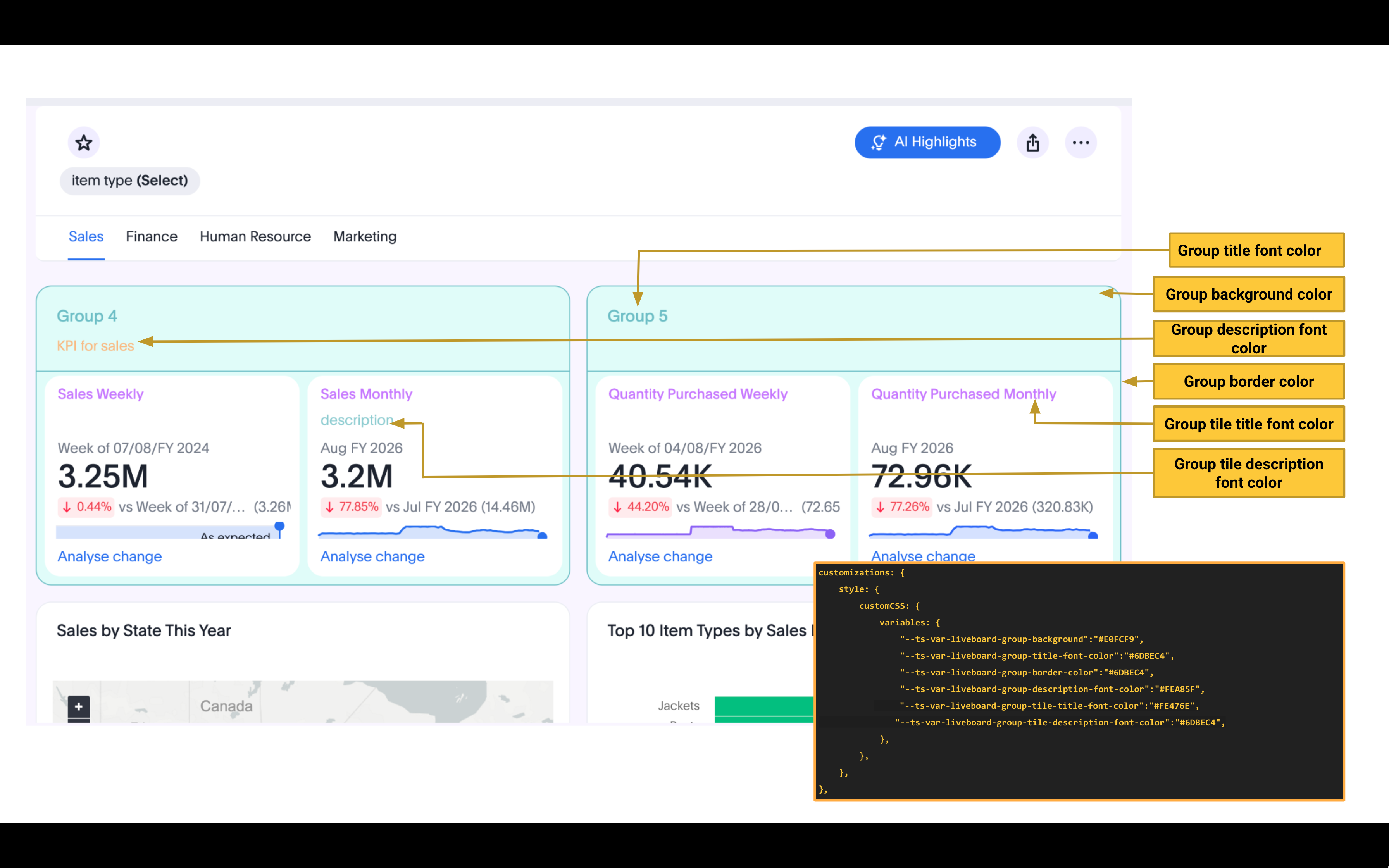
Liveboard grouping and styling Early Access🔗
Use the following variables to customize the Liveboard visualization groups and style elements.
|
Note
|
To enable this feature contact ThoughtSpot support and set |
| Variable | Description |
|---|---|
| Background color of the group. |
| Color of the group title. |
| Color of the border for the group. |
| Color of the group description text. |
| Color of the title of the vizualizations in the group. |
| Color of the description of the vizualizations in the group. |
| Border color of the tiles in the Liveboard. |
| Background color of the tiles in the Liveboard. |
Visualization and Answer🔗
Use the following variables to customize UI elements for Liveboard visualizations and Answers generated from Search data, Natural Language Search, and Spotter.
Charts and tables🔗
You can customize the look and feel of the visualization tiles on a Liveboard, styles for title and description text of charts and tables.
| Variable | Description |
|---|---|
| Font color of the title text of a visualization or Answer. |
| Font family specification for the title text of a visualization/Answer. |
| Text transformation specification for visualization and Answer titles. |
| Font color of the description text and subtitle of a visualization or Answer. |
| Font family specification of description text and subtitle of a visualization or Answer. |
| Text transformation specification for description text and subtitle of a visualization or Answer. |
| Border-radius for the visualization tiles and header panel on a Liveboard. |
| Box shadow property for the visualization tiles and header panel on a Liveboard. |
| Background color of the visualization tiles and header panel on a Liveboard. |
| Background color of the legend on a visualization or Answer. |
Chart switcher🔗
To customize the chart switcher icon  on Answers, use the following variables:
| Variable | Description |
|---|---|
| Background color of the chart switcher on search results and Answer pages. |
| Background color of the currently selected chart type in the chart switcher. |
Chart selection widget🔗
The chart selection widget appears on clicking the Change visualization icon  on the Answer page or when you open a visualization in the Edit mode.
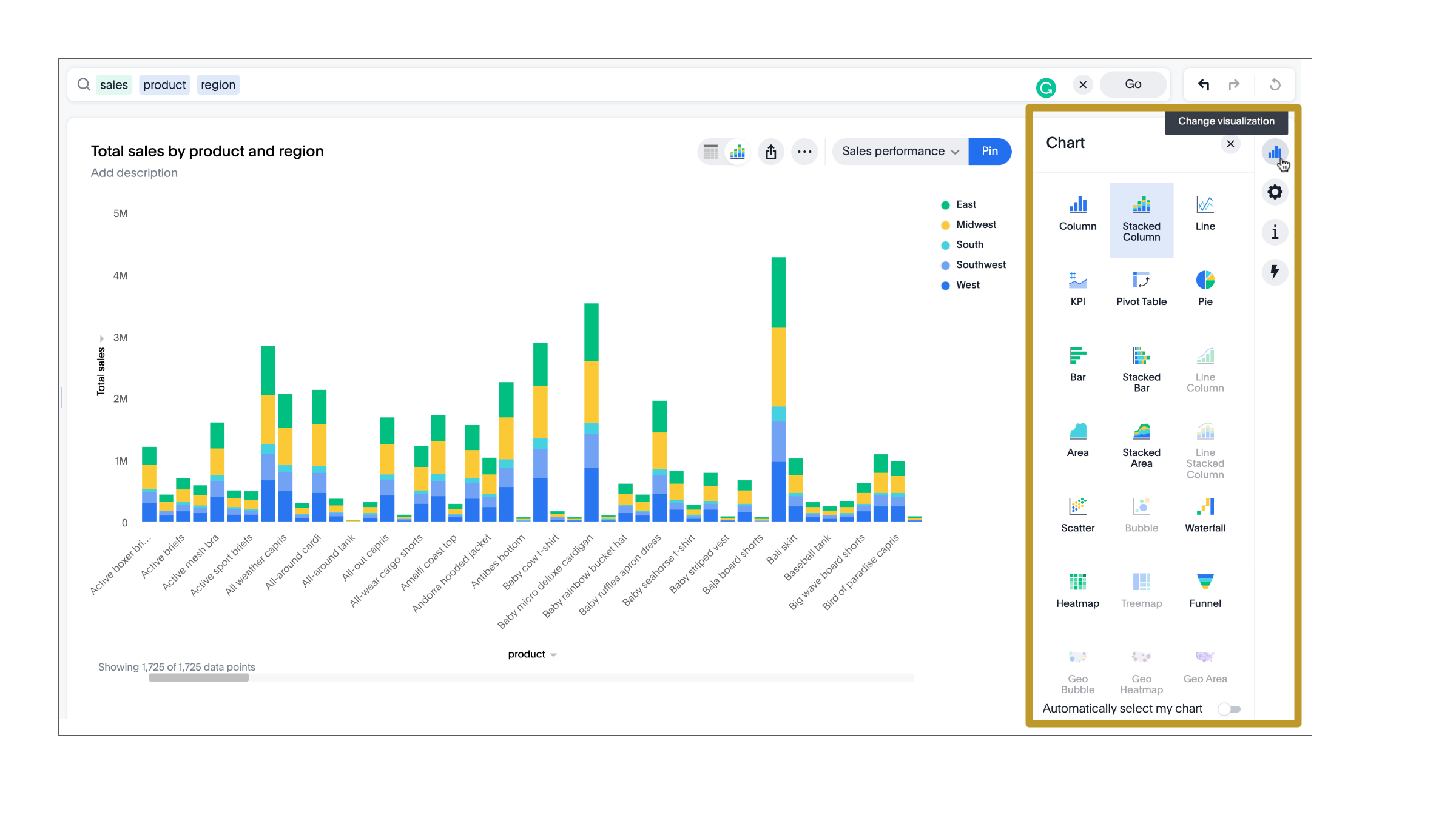
Use the following variables to customize the background color of the chart type icons:
| Variable | Description |
|---|---|
| Background color of the selected chart type on the chart selection widget. |
| Background color of the chart type element when a user hovers over a chart type on the chart selection widget. |
Axis title and labels on charts🔗
Use the following variables to customize X-axis and Y-axis titles and labels on charts.
| Variable | Description |
|---|---|
| Font color of axis title on charts. |
| Font family specification for the X and Y axis title text. |
| Font color of the X and Y axis labels. |
| Font family specification for X and Y axis labels . |
Filter chips on Liveboard and Answers🔗
Filter chips appear on the Liveboard, Answer, and visualization pages when filters are applied on charts and tables. You can use the following variables to customize the look and feel of filter chips.
| Variable | Description |
|---|---|
| Border-radius of filter chips. |
| Shadow effect for filter chips. |
| Background color of filter chips. |
| Font color of the filter label when a filter chip is selected |
| Background color of the filter chips when selected. |
| Font color of the text on filter chips when hovered over. |
| Background color of filter chips on hover. |
| Font color of the text on filter chips. |
| Font family specification for the text on filter chips. |
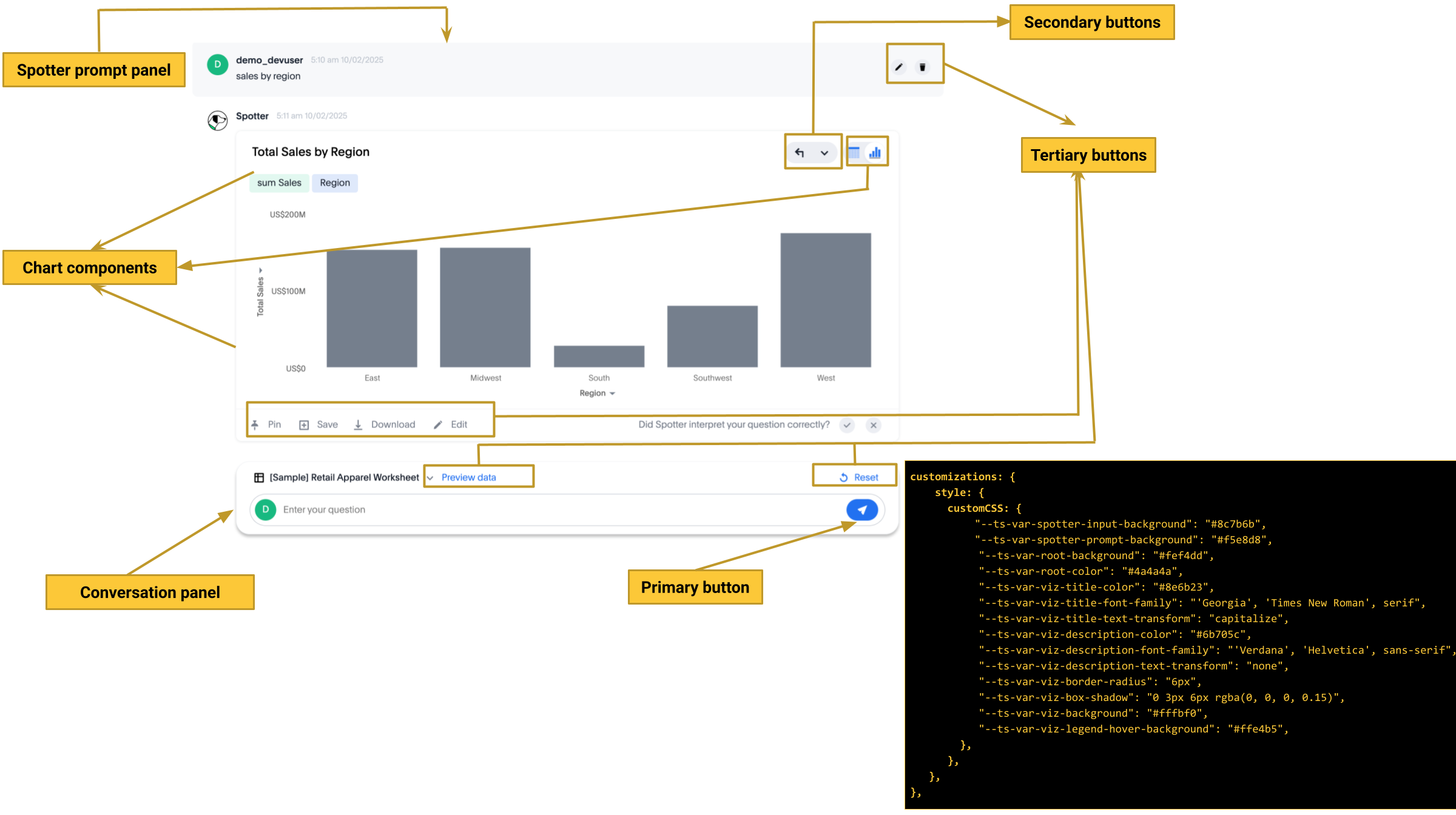
Spotter interface🔗
The Spotter interface includes several customizable components.
| UI element | CSS variables |
|---|---|
Conversation panel | Use the following variable to change the background color of the panel:
|
Prompt panel | The prompt panel appears after a user clicks the prompt button
|
Buttons | To customize the Spotter prompt |
Charts and tables generated by Spotter | Use chart variables. |
Application level settings for Spotter interface | Use application-level CSS variables, such as |

The following figure shows the UI components and elements that can be customized using CSS variables:
Natural Language Search interface🔗
The Natural Language Search interface is also referred to as Sage Search. The Sage Search interface includes several elements such as the header, search bar, suggested queries, and sample questions panel.
| Variable | Description |
|---|---|
| Background color of the header bar on the Sage Search page. |
| Background color of the data source selector. |
| Font color of the search text. |
| Background color of the Sage search box. |
| Background color of the Answer page generated from a Sage Search query. |
| Background color of the sample questions panel. |
| Font color of the search query text in the sample questions panel. |
| Background color of the sample question panel on hover |
| Background color of the data source selector on hover. |
| URL path of the search icon on the header bar. |
| Color of the search icon on the header bar. |
| Visibility of the search icon on the header bar. |
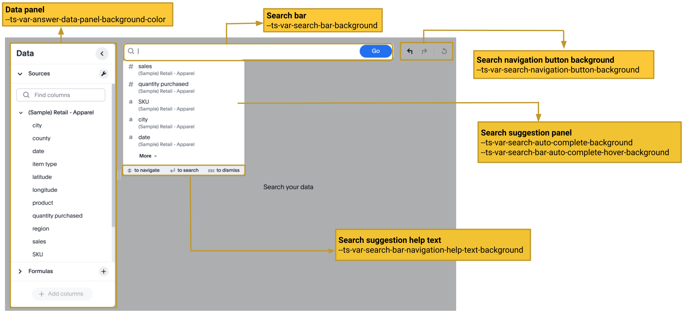
Search bar and Data panel🔗
The search bar element that allows passing search tokens.
| Variable | Description |
|---|---|
| Font color of the text in the Search bar. |
| Font of the text in the Search bar. |
| Font style of the text in the Search bar. |
| Background color of the search bar. |
| Background color of the search suggestions panel. |
| Background color of the navigation panel that allows you to undo, redo, and reset search operations. |
| Background color of the navigation help text that appears at the bottom of the search suggestions panel. |
| Background color of the search suggestion block on hover. |
| Font color of the text in the search suggestion panel. |
| Font color of the sub-text that appears below the keyword in the search suggestion panel. |
| Background color of the data panel. |
| Background color of the vertical panel on the right side of the Answer page, which includes the options to edit charts and tables. |
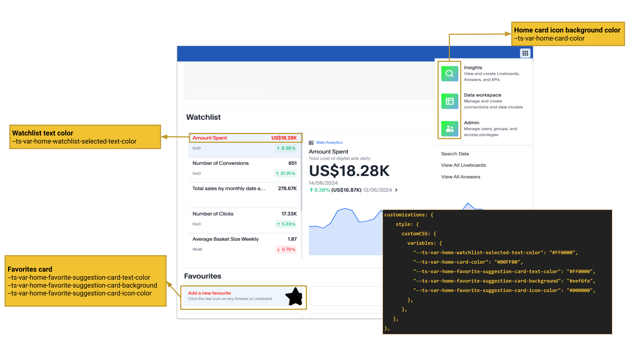
Homepage modules (New experience mode)🔗
If the new navigation and homepage experience is enabled on your instance and in the embedded view, the homepage presents favourites, KPI charts on the watchlist, a library of Liveboards and Answers, and trending charts as separate modular elements. To customize the look and feel of these elements, you can use the following CSS variables:
| Variable | Description |
|---|---|
| Font color of the text in the selected panel in the Watchlist module. |
| Background color of the app icons in the app selector panel. |
| Font color of the text on the favorites card. |
| Background color of the favorites card. |
| Background color of the star icon on the favorites card. |
| Font color of the text on the favorites card. |
UI element reference🔗
Sample CSS file with variable definitions🔗
ThoughtSpot provides a default CSS file containing the most common variables and rules supported in a given release version. The following is an example of what is included in the full variables file:
:root {

  /* Application-wide background, app-wide text color, app-wide font, app-wide text transform */
    --ts-var-root-color: initial;
    --ts-var-root-background: initial;
    --ts-var-root-font-family: initial;
    --ts-var-root-text-transform: initial;
    --ts-var-application-color: initial;
    --ts-var-root-secondary-color: initial;

  /* Top navigation panel */
    --ts-var-nav-color: var(--ts-var-root-color);
    --ts-var-nav-background: initial;

  /*  Buttons */
  /* Application-wide button design for main buttons. For example, Search data*/
    --ts-var-button-border-radius: 5px;

  /* Application-wide button design for smaller buttons. For example, buttons with share and favorite icons*/
    --ts-var-button--icon-border-radius: 5px;

  /* Primary buttons: For example, the Go button in the search bar, the Pin and Save buttons on the Search page */
    --ts-var-button--primary-color: var(--ts-var-root-color);
    --ts-var-button--primary-background: initial;
    --ts-var-button--primary--hover-background: initial;
    --ts-var-button--primary--font-family: var(--ts-var-root-font-family);
    --ts-var-button--primary--active-background: initial;

  /* Secondary buttons. For example, the Edit and Explore buttons on the Liveboard page*/
    --ts-var-button--secondary-color: var(--ts-var-root-color)
    --ts-var-button--secondary-background: initial;
    --ts-var-button--secondary--hover-background: initial;
    --ts-var-button--secondary--font-family: var(--ts-var-root-font-family);
    --ts-var-button--secondary--active-background: initial;

  /* Tertiary buttons. For example, the Undo, Redo buttons on the Search page*/
    --ts-var-button--tertiary-color: var(--ts-var-root-color);
    --ts-var-button--tertiary-background: initial;
    --ts-var-button--tertiary--hover-background: initial;
    --ts-var-button--tertiary--active-background: initial;

  /* Checkboxes */
    --ts-var-checkbox-error-border: initial;
    --ts-var-checkbox-border-color: initial;
    --ts-var-checkbox-hover-border: initial;
    --ts-var-checkbox-active-color: initial;
    --ts-var-checkbox-checked-color: initial;
    --ts-var-checkbox-checked-disabled: initial;
    --ts-var-checkbox-highlighted-hover-color: initial;
    --ts-var-checkbox-background-color: initial;


  /* Menu components */
    --ts-var-menu-color: var(--ts-var-root-color);
    --ts-var-menu-background: initial;
    --ts-var-menu-font-family: var(--ts-var-root-font-family);
    --ts-var-menu-text-transform: var(--ts-var-root-text-transform);
    --ts-var-menu--hover-background: initial;
    --ts-var-menu-seperator-background: initial;
    --ts-var-menu-selected-text-color: initial;

  /* Dialogs and modals that prompt users to perform an action or enter information */
    --ts-var-dialog-body-background: initial;
    --ts-var-dialog-body-color: var(--ts-var-root-color);
    --ts-var-dialog-header-background: initial;
    --ts-var-dialog-header-color: var(--ts-var-root-color);
    --ts-var-dialog-footer-background: initial;

  /* Segment control */
     --ts-var-segment-control-hover-background: initial;

  /* Lists on pages such as Liveboards, Answers, Data objects */
     --ts-var-list-selected-background: initial;
     --ts-var-list-hover-background: initial;

  /* Liveboard */
    --ts-var-liveboard-edit-bar-background: initial;
    --ts-var-liveboard-cross-filter-layout-background: initial;

  /* Visualizations and Answers */
  /* Title text */
    --ts-var-viz-title-color: var(--ts-var-root-color);
    --ts-var-viz-title-font-family: var(--ts-var-root-font-family);
    --ts-var-viz-title-text-transform: var(--ts-var-root-text-transform);

  /* Subtitle and description text */
    --ts-var-viz-description-color: var(--ts-var-root-color);
    --ts-var-viz-description-font-family: var(--ts-var-root-font-family);
    --ts-var-viz-description-text-transform: var(--ts-var-root-text-transform);

  /* Visualization tiles on a Liveboard*/
    --ts-var-viz-border-radius: initial;
    --ts-var-viz-box-shadow: initial;
    --ts-var-viz-background: initial;
    --ts-var-viz-legend-hover-background: initial;

  /* Filter chips Liveboard and Answer pages */
    --ts-var-chip-border-radius: initial;
    --ts-var-chip-title-font-family: var(--ts-var-root-font-family);
    --ts-var-chip-box-shadow: initial;
    --ts-var-chip-background: initial;
    --ts-var-chip-color: var(--ts-var-root-color);
    --ts-var-chip--hover-background: initial;
    --ts-var-chip--hover-color: var(--ts-var-root-color);
    --ts-var-chip--active-background: initial;
    --ts-var-chip--active-color: initial;

  /* Axis titles and labels*/
    --ts-var-axis-title-color: var(--ts-var-root-color);
    --ts-var-axis-title-font-family: var(--ts-var-root-font-family);
    --ts-var-axis-data-label-color: var(--ts-var-root-color);
    --ts-var-axis-data-label-font-family: var(--ts-var-root-font-family);

  /* Chart selection widget on answers and visualizations*/
    --ts-var-answer-chart-select-background: initial;
    --ts-var-answer-chart-hover-background: initial;

  /* Chart switcher on Answers*/
    --ts-var-answer-view-table-chart-switcher-active-background: initial;
    --ts-var-answer-edit-panel-background-color: initial;

  /* Spotter interface */
    --ts-var-spotter-input-background: initial;
    --ts-var-spotter-prompt-background: initial;

  /* Search bar, search navigation and auto-suggestion panels */
    --ts-var-search-data-button-font-color: var(--ts-var-root-color);
    --ts-var-search-data-button-background: initial;
    --ts-var-search-data-button-font-family: var(--ts-var-root-font-family);
    --ts-var-search-bar-text-font-color: var(--ts-var-root-color);
    --ts-var-search-bar-text-font-family: var(--ts-var-root-font-family);
    --ts-var-search-bar-text-font-style: initial;
    --ts-var-search-bar-background: initial;
    --ts-var-search-auto-complete-background: initial;
    --ts-var-search-auto-complete-font-color: var(--ts-var-root-color);
    --ts-var-search-auto-complete-subtext-font-color: initial;
    --ts-var-search-navigation-button-background: initial;
    --ts-var-search-bar-navigation-help-text-background: initial;
    --ts-var-search-bar-auto-complete-hover-background: initial;

  /* Data and edit panels on Answer page */
    --ts-var-answer-data-panel-background-color: initial;
    --ts-var-answer-view-table-chart-switcher-background: initial;

  /* Modular Homepage (New experience) */
    --ts-var-home-watchlist-selected-text-color: initial;
    --ts-var-home-card-color: var(--ts-var-root-color);
    --ts-var-home-favorite-suggestion-card-text-color: initial;
    --ts-var-home-favorite-suggestion-card-text-font-color: initial;
    --ts-var-home-favorite-suggestion-card-background: initial;
    --ts-var-home-favorite-suggestion-card-icon-color: initial;

  /* Natural Language Search panel*/
    --ts-var-sage-bar-header-background-color: initial;
    --ts-var-source-selector-background-color: initial;
    --ts-var-sage-search-box-font-color: initial;
    --ts-var-sage-search-box-background-color: initial;
    --ts-var-sage-embed-background-color: initial;
    --ts-var-sage-seed-questions-background: initial;
    --ts-var-sage-seed-questions-font-color: initial;
    --ts-var-sage-seed-questions-hover-background: initial;
    --ts-var-source-selector-hover-color: initial;
}